John Gavin used to draw on the walls when he was a child. It was probably the first hint of the career he would later pursue, given how much of his design adorns various surfaces across Ireland. After studying Visual Communications Design, his father spotted a job in the Irish Times and John had his first job in Dublin. This started him on the path that would lead him to working in London with brands like Adidas, Mercedes Benz, Volvo, Radisson Hotels, and the BBC. He also ran his own studio for a few years in London but says the call to return home was always very strong – so in 2011 he came home to Waterford and set up TrueOutput. Gavin says that all their work comes via recommendation, which allows them to be selective on what is the right fit for the studio: “At the moment we’re working on a large branding project for a new hotel on St Stephen’s Green, an exclusive spirits project for The Cashel Palace Hotel, and we’ve just completed a rebrand of the 73-year-old Wexford Festival Opera; we like diversity, unique challenges and making great things for great people.”

In 2014 it was announced that Mark Reynier, who had reopened Bruichladdich Distillery on Islay off the coast of Scotland, had bought the former Guinness Brewery at the end of the quays in Waterford city, and that he planned to open a distillery there. The stars were aligning; Gavin had been to Bruichladdich and appreciated it not just as a whisky fan but as a designer – the brand was known for its un-whisky-like bottles and styled itself as a ‘progressive’ distiller. Whatever Reynier was going to do in Ireland, chances were it would be bold.
“I knew he was going to do something special. I took a punt and got in touch and he said to pop down the next day. The place was as Guinness had left it and they were working on reconfiguring it to become a distillery. I was a bit like going to Willy Wonka’s factory to meet the man himself. We chatted about Waterford and our work and ended up going for a pint. There was no work for us at that stage but the seed had been planted.
“We eventually began to do a trickle of work, like signage and getting a website up and running. Proving our skills and building a relationship along the way. When the offer to pitch for the full brand and packaging came we jumped at the prospect. We were up against larger specialist firms in the UK, but we eventually got the nod from the board and it was the beginning of a very interesting journey.”
When building a brand, work starts from the ground up – Gavin had to fully immerse himself in whisky design to begin the process.
“It starts with in-depth research and absorption into the industry. Coming to it already with an interest in the whisky world, we had a little head start. You need to understand what is out there and where they fit into the landscape. You begin to see patterns in the design approach, with common tropes being used over and over. This helps understand what kind of things to avoid and also gives an impetus to push ourselves farther. The crux of the brief from Mark was to create “A brand unlike any other, for a whisky unlike any other.” So from the outset we knew it wasn’t going to be like anything else.
“We were given a key to the operation. Immersed in every aspect of their unique whisky making process. Understanding barley varieties, meeting the farmers growing that barley, the maltings, the custom made storage facilities, and then once it arrived at the distillery the process of making spirit. Learning about the unique machines at their disposal like the hydromill and mash filter. Getting to know the team with the affable Ned and Neil at the help of distilling and brewing. Then out to the custom maturation warehouses, all set up to flow with sea breezes. The bottling lines and the technicality of that part of the puzzle. The fascinating concepts of terroir, and biodynamics. The honesty and integrity was unlike anything I’d ever seen and we had unfettered access to it all.
“After the research, the next phase is looking at the brand strategy where this will be positioned which gives a platform for the visual work to grow out of. Following on is the visual brand identity phase, it is hard to explain but this diagram goes some way to illustrate the process – organised chaos.

“The development of the visual brand identity; logo, colour, symbols, typography, tone of voice is a long process of exploration, editing, discarding, and ensuring no stone is left unturned in the quest to solve the problem.”
Behind the striving for a subjective perfection – ie, a happy client – Gavin was also aware of the burden on him to build something fresh, modern and bold that would stand on its own two feet and be loved by fans worldwide.
“There is undoubtedly a weight of expectation on your shoulders. This is going to be launched across the world, to be critiqued, and for whiskey fanatics to pore over every detail. We kept a very tight creative unit; myself, my team, Mark Reynier and Mark Newton (Head of Brand) and this ensured we were insulated from outside interference to really explore way beyond the normal in a project of this kind.
“Having the luxury of time at this development phase was vital to enable us to reach the final destination. Everything needed to be meticulous, as precise as the production processes used to make the whisky, no room for errors. The final results are the product of almost 4 years of work. Simplicity isn’t just a visual style. It’s not just minimalism or the absence of clutter. It involves digging through the depth of the complexity. To be truly simple, you have to go really deep. Simplicity is the ultimate form of sophistication. The first limited edition bottles of Waterford Whisky were launched in 2020. The release was tempered by a certain pandemic but that didn’t stop it being an instant success, selling out immediately.
“Once released, the product and brand take on a life of their own. Years of work released into the world. The reception has been really positive with genuine engagement and excitement. We went to the whisky shows, and someone would comment on the bottle design and Mark would pull me into the conversation to say here’s the guy that designed it. That level of connection and detail is not something people get to experience. We’ve also found out there is nothing quite like the fervour of whiskey fans. We’ve also picked up lots of design awards and accolades along the way.”
I asked John Gavin if working on a brand is a 50/50 operation with the client, and how he navigates that tension between what they want and what you would choose.
“The best results come when there is collaboration. We like to work this way. You get to the core of what is required, the real insights. It’s about listening intently. It takes a lot of effort to listen really hard and then deliver beyond expectations. We never go into a project with any preconception of how it might look.
“Mark brought this incredible vision and we interpreted that. He was not prescriptive of how he wanted it to look. But he knew it when he saw it. We would present, discuss and iterate. There are components from the very first presentation that were retained and followed through to the end. We create an entire brand world, all the components are like ingredients or materials used to communicate the ethos and as practical tools for marketing and day to day brand activity.
“Funnily the Bruichladdich design is one we had admired for a while. But it was a hindrance because we needed to distance Waterford from that, and ensure it didn’t look like Mark’s 2.0 version of it. So it needed to be a clearly different proposition.
“We were given full freedom to express our creativity through everything. But it would not be possible to deliver without the vision, faith and creativity of Mark Reynier and Mark Newton.”
Gavin says that being part of the vision from day one created a more coherent concept, and that even before the distillery was commissioned TrueOutput were at the table ‘discussing what it could be’: “Anything you see designed for Waterford we’ve been involved with. The bottle design, logo, packaging, every label, the 25-metre square map hanging over the stills room, websites, exhibitions, interiors, art installations, signage, animations, apparel, printed collateral, vehicles, we have designed it all.
“This ensured 100% creative control and consistency of execution across every touch point. We understand the overall complexity and can bring creative solutions to ideas that accelerate the brand. Design is not something you just plug in and out, if it’s embedded from the start the value is immeasurable. We have created efficiencies, through things like design systems for trade shows for example, and saved the distillery money through creative thinking by coming at things from another angle, particularly on the bottle design. The old quote, “good design is good business” rings true.”
Asked what the best part of the project was, he says that the opportunity to collaborate with Mark Reynier was not something that comes around too often, but of the brand itself, the iconic – and defiant – blue bottles are up there.
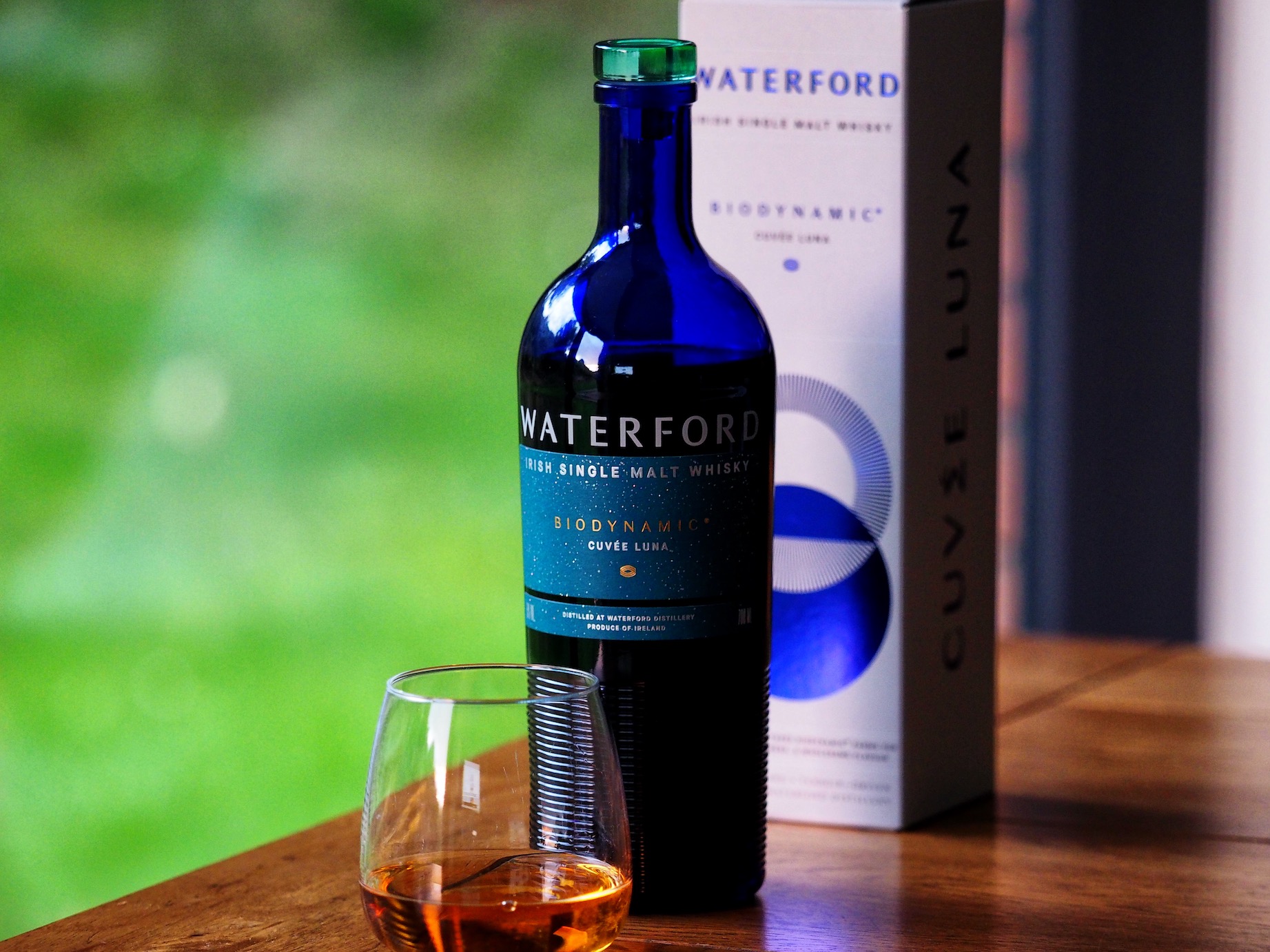
“I’d have to say the blue bottle is the real standout of the project. It’s what everyone comments on and is intrigued by. The design challenge was to make something unique – with the dream of perhaps creating an iconic classic. We were inspired by blue glass bottles once traded on the quays in Waterford and the contours on the bottom of the glass were inspired from the corrugated ridges on the distillery building itself. The curves, proportions, weight, silhouette were all painstakingly considered. It is our most technical project to date, so much so that the final bottle was modelled in software commonly used to design aircraft. The day we saw the bottles, thousands of them, rolling off the production line was quite a moment.
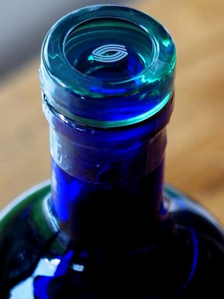
“I’m also very fond of the little barley symbol, (you can see it on top of the stopper), which has gradually become a shortcut to the brand and appears across lots of different applications. Shaped like a grain of barley which is at the core of everything they do. It conveys the continuous cycle of nature, the furrows in the fields, the panelling lines of the distillery building and the eye of mother earth herself. We’ve had enquiries from as far away as Taiwan asking us to talk about it. The devil is in the details.”
As for other Irish whiskey brands he admires, he says that the minimalism he favours is not always common in the language of whiskey brand design.
“I do lean towards a ‘less but better’ philosophy and there isn’t much of that in Whiskey branding. Most whiskey seems to cling onto the past in terms of how it looks. I also can see the ‘mutton dressed up as lamb’ from a mile away, where the product in the bottle is inferior to the attempts to dress it up.
“But make no mistake, whiskey branding is not an easy thing to pull off. The multiple stakeholders, the competitive landscape, labelling compliance red tape can all have diminishing effects on the end product. So I applaud anyone who can get a design from concept to shelf. In my opinion the branding must elevate and also represent honestly what is inside. Truth always wins in the end.”
